Main Menu
Is your website leaking leads? Or maybe it isn’t getting the traffic you need to fill up your funnel in the first place? Does it still match your brand, business goals, products, or services? We’ll take a look at what makes a successful website – from sparkling website copy and imagery to the nitty gritty of the tech side.
In short, a successful website is easy to navigate, looks visually appealing, is speedy, has some great content your users want to read, and is secure. It should also hit your company’s goals and know exactly who it’s been created for and why.
Let’s take a look at:
As we very subtly hinted in the title, you need more than just great copywriting for website success. Think of it as a carefully built pyramid, where your branding is the cherry on top, and your strategy, development, and UX design are the first building blocks.
There’s a step-by-step process to what makes a successful website:
For website success, there needs to be a clear goal. And it needs to be really easy for your users to get to that goal. The goal can’t be one you just pluck out of thin air, but it should be pretty easy to decide on once you dig into your customers’ needs.
For an e-commerce website, the goal will almost always be conversions (although basket value comes in close second). B2B services websites usually focus on leads, newsletter sign-ups, or lead magnet downloads. And editorial sites are all about dwell time and the number of pages visited.
Your website’s goal will almost always match your business’ main goal.
Website design covers everything from how visually appealing it is, to how much your website reflects your brand. It includes how easy it is for your users to get from their entry on the site to the goal you have for them.
It’s also really important to keep your website accessible for visually impaired users, and others who have neuro-diverse needs. We’re talking no white or colourful text on a black background, for example. To keep your website accessible, you should also ensure all of your images have the correct alt text, give descriptive names to your links (e.g. don’t use “click here”, use “find out more about us”), and be careful with how you use dynamic content (like pop-ups and screen overlays).
There are plenty of brilliant resources if you’re looking for more information on how to make your website accessible.
–
Choosing your website developer, the Content Management System (CMS) you’ll use, and figuring out all of the nitty-gritty technical details are the first part of creating a successful website. But there are other elements to consider too.
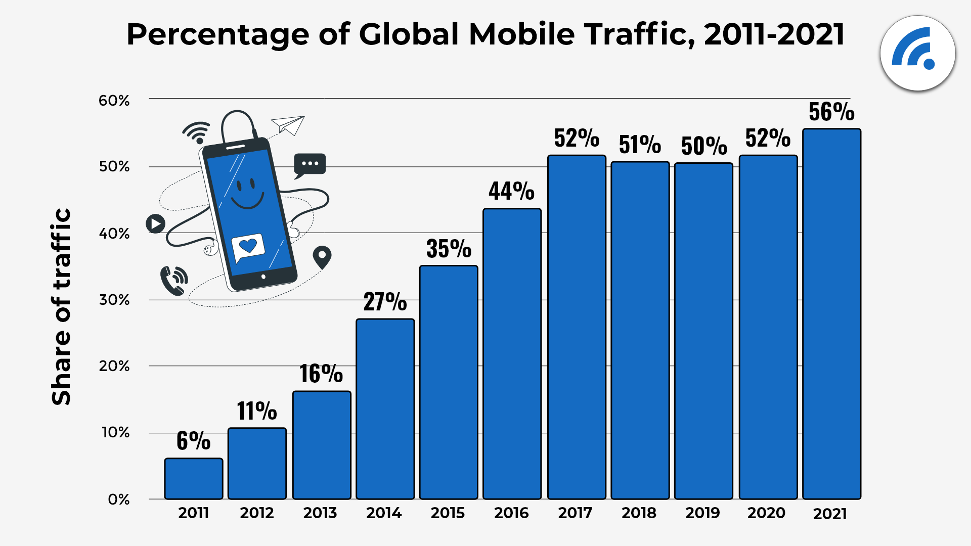
A great website is always easy to use on mobile. We’ve been given fair warning on the number of users switching to mobile browsing, and in January 2023, 61% of all website traffic came from mobile. But a shocking number of websites still aren’t working for mobile users.
You need to make sure your website is well-developed with your users in mind. For example, if the majority of your traffic comes from mobile, it should be developed on mobile first. Make sure your code is stable. If you need to bring the coding in-house, ensure it’s in the same language your team codes in. If it’s an e-commerce site, set it up to collect sales from day one.
It may seem a bit overwhelming, but this foundational work will set you on the path to a successful website.
Your website is often the hub of your brand. It’s where your brand should shine the brightest, and it should be instantly recognisable as soon as someone lands on the site. That means every single page – from the lowest traffic blog post or product page to your homepage and About Us pages.
Keep your brand consistent with your other channels too.
The elements that go into your brand include:
And these need to be obvious on every single page.
53% of mobile users will abandon sites that take over 3 seconds to load. That isn’t much time to catch your target audience. And the stats aren’t much different for desktop and tablet sites either. It’s thought that about 40% of all users won’t wait more than 3 seconds for a page to load.
The best ways to keep your website speedy are:
One of the most important elements of what makes a successful website is its ease of use. Users need to feel they know how to get around, make a purchase, and find the content they want.
The best way to make sure it’s easy to use is to test, test, test. Ask your whole team to test it using a variety of browsers and devices, or outsource this task to a specialist company.
Once you’re happy it works fairly well, start to test your site on users, looking out for key metrics like:
You can also try A/B testing and eye tracking to test out what works.
The worst-case scenario is that your website is very untrustworthy. In this case, most browsers will block users from visiting it, or at least show a warning.
Or it might just look untrustworthy, which means users won’t buy anything, believe what you’ve written, or pick up the phone.
How to make your website more trustworthy:
Ways to build more trust with users on your website:
All websites need relevant, useful, and original content. On every single page. It’s important you keep this fresh, make sure it’s what your users want to read, and provide authoritative information on the topics you choose to talk about.
Depending on your website goals, your content needs to include:
We discuss great content for a successful website in more detail below.
Understanding your users and the goals of your website is an important step in creating one that’s truly successful. You probably have more than one type of user, for example, potential clients, potential hires, and potential suppliers. And it’s important to know exactly what they’ll be looking for on your site, and what you’d like them to do when they visit.
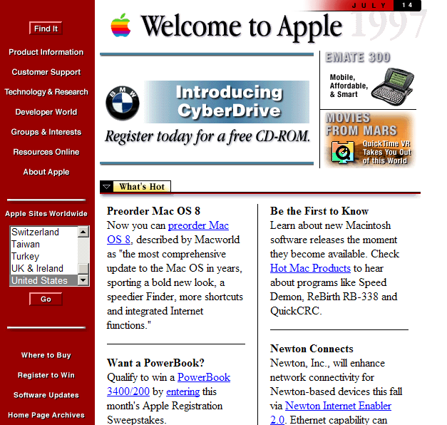
What makes a successful website today is very different from the past (see image above). We’ve come a long way and have some brilliant tools that make websites easy to use, great to look at, and make users want to spend time on them. A few of our favourite websites are:
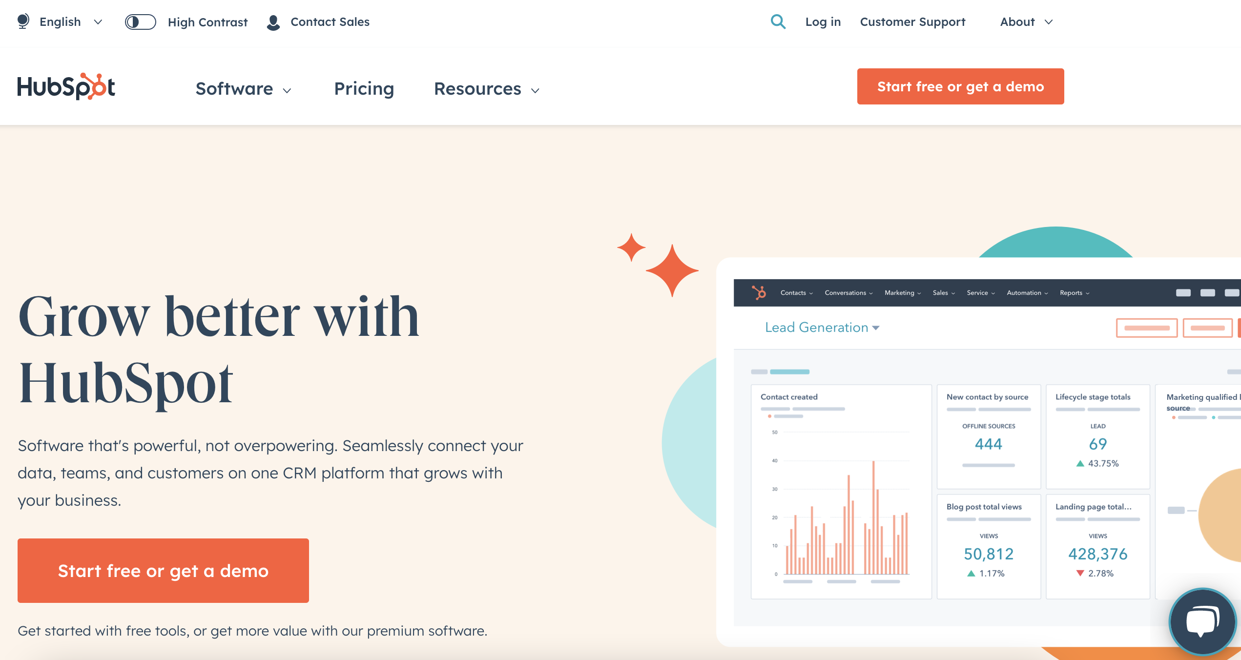
Hubspot’s website is a masterclass in how to ‘do’ content marketing. But their design and functionality are brilliant too. The homepage breaks down what you can do into brilliantly simple sections, while you’re aware it’s a deep site that you can delve into as well. It’s easy to get started, see exactly what they do, or simply explore all of the useful content they have on offer.

It’s immediately clear what the company does, who it’s for, and how you can find out more as a rider or a driver as you hit the Uber site. The Key Messaging is compelling, snappy, and tells you if it’s right for you. And the website is clearly split into three sections for its three very clear uses. As you scroll further down, Uber addresses any questions you may have before you’ve even thought to ask them.
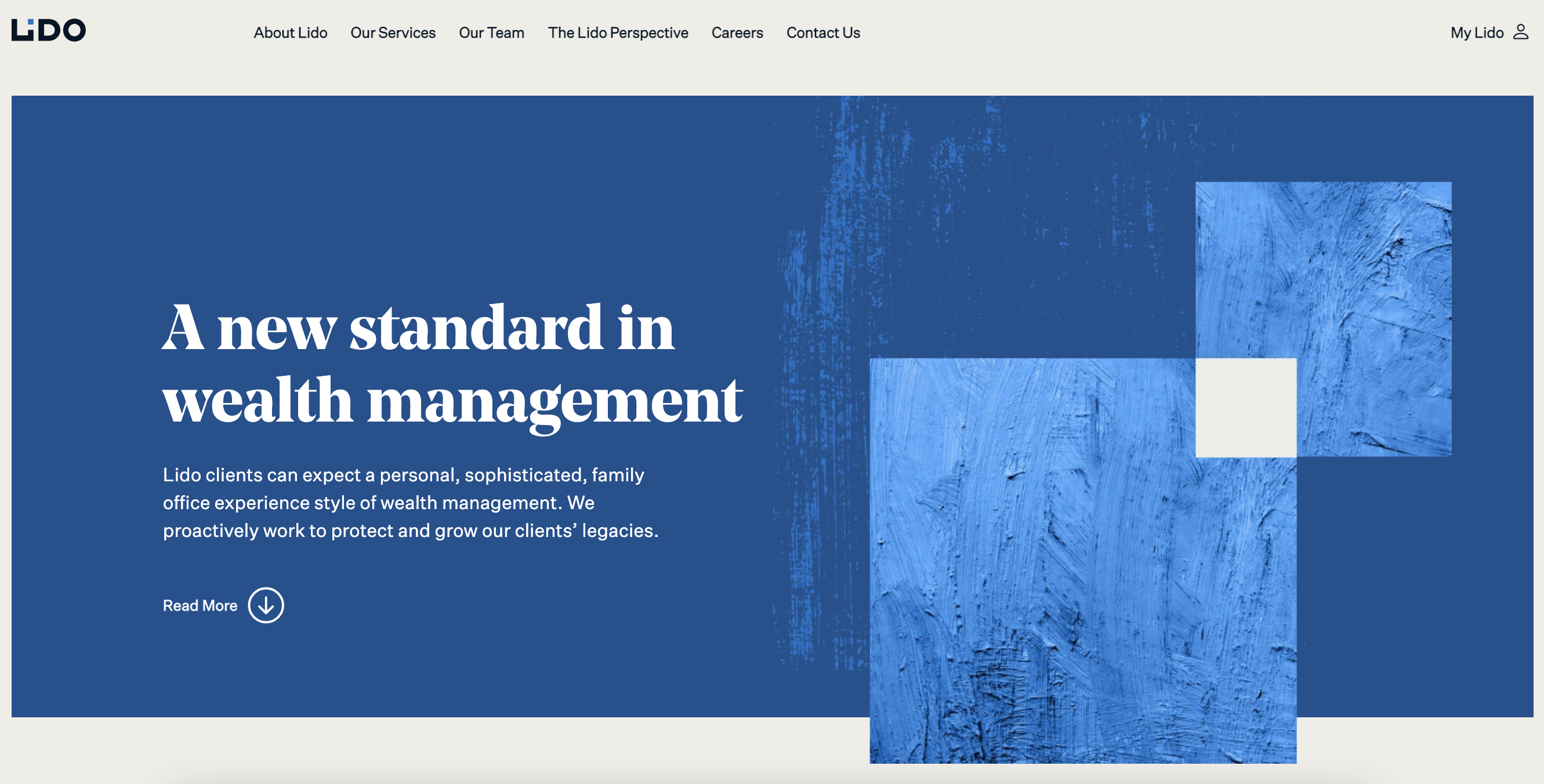
Lido’s website is beautifully designed by our friends at This Place. The attention to detail in the design is brilliant – for example, different colours following you depending on the service you’re interested in. The design evokes a sense of calmness, while the colour blue is a slight nod to the name of the company (Lido is an Italian word for outdoor swimming pool). The design is also totally unique and stands out in a sea of overly masculine, cluttered websites in the wealth management industry.
We promise we aren’t biased, even though they’re one of our clients.
The best place to find examples of successful websites is through website awards sites (try saying that three times, fast).
The Webby Awards site, and the Awwwards site (see what they did there) are two of our favourites.
Before you even begin to build a website you need to decide its purpose. Do you want it to generate leads? Build your brand? Cement you as a leading authority in your industry? All three?
Once you’ve decided on the purpose, it’s time to set the KPIs for your successful website. If you have an existing site, decide how much you want to see it improve in performance over the next year. Or, if you’re starting from scratch, look up industry averages and see what you think you can achieve.
When it comes to KPIs, less is definitely more. It’s best to have one dominant KPI and then 1-2 supporting. For example, if conversion is your main goal and customers usually buy on their third visit to the site, you may want to look at the number of website sales first, then traffic, and how many return users you have.
Traffic is a worthy goal for your website. But relevant traffic, and how much you’re paying for that traffic, are important factors to consider too.
If you have no idea how much traffic you’re hoping for, see if you can find some industry standards, or combine tools like ahrefs or SEMRush with Google Adwords data to get a rough idea. This won’t give you accurate numbers for the traffic you can expect, but it can help to have a loose starting point.
If you have a full marketing team, you can ask each team (PPC, SEO, email, social, etc) to give you data to help you decide what might work.
Leads as a KPI ties in nicely with your business goals. You can work with the rest of the business to decide how many leads need to be brought in through the website, and the ways you’re going to get them there.
If customers are able to buy your product or service online, one of the KPIs to measure the success of the website should be conversions. Conversion is generally easy to measure, and the best way to set the target for new websites is to work out the size of your customer base, and what you’d like your share of that to be.
Editorial websites prioritise dwell time as a KPI. If you have an informational site, or you have a product or service with a long lead time (the time between your customer hitting the website for the first time and buying your product or service), this is the KPI for you. You’ll have different dwell times for different pages, but the overall site goal should take this into consideration.
Content is a big part of what makes a successful website. Each page exists for a different reason. Not every piece needs to be salesy, but they all need to contribute to the overall sales of your website.
If you’re creating website content that sells, you need to have a clear strategy, and every page needs to have its purpose.
What makes successful website copy depends on the page you’re writing for, and what you’d like your user to do after they read it. There are some general rules to follow when you’re rewriting your website copy though:
What problem are you trying to solve for them? What do they already know? What stage of the user journey are they in? Who are they and what are they interested in?
Knowing your customer is key to all sales, marketing, and product success, and every team is likely to have a slightly different opinion. Make sure the whole company is on the same page, and write your content so it speaks directly to your audience.
If someone read this with no logo or design elements, would they know your company wrote it? Does it flow on from the other copy they’ve read in their relationship with your business? Brand is a huge part of creating successful website content, and once you get the hang of it, it’ll be easy to decide what fits with your voice and what just doesn’t work.
Making sure your words sound like your brand is essential for a successful website.
Writing clear and simple copy is much harder than writing extensive content full of waffle – and it’s deceptively hard to do. Pick a few key points you want to make, and say them in as few words as possible. It’s best to stick to one point per sentence, and one theme per paragraph.
It’s well established that we’re all lazy readers. We want to be able to understand the essence of what we’re reading with a quick scroll. So, make sure you break your copy down into short paragraphs, use lots of headings, and add bullet points where you can. Include quick summaries at the beginning and end of the text for ultimate scannability.
At Proof Content, we call this ‘thinking it all the way through’. Let’s say you have a SaaS productivity tool. Yes, it helps you get organised, but it does so much more than that.
Think it all the way through. It helps you use your team for more strategic work, which leads to more sales, a happier team who are easier to retain, and industry-leading work. Lead with those benefits, rather than the functionality.
Your copy needs to be different from the 10-10,000 other pieces that exist on the same topic. Add in quotes, data, and original research if you can. You also need to add in your own thinking and company expertise – something your reader is unlikely to know already. If you don’t know very much on the topic, can you interview someone about it, commission some research, or make a connection with some other industries?
For more on being a better writer, read Proof Content’s Rules for Writers.
There are nine elements that go into what makes a successful website. Your design, technology, content, UX, strategy, and brand all need to work closely together for the best possible results. If you get these nine fundamentals right, you’ll create something your customers will love and want to return to.
A successful website is also never finished – it’s important to test what works and keep tweaking your content, design, and layout to achieve the best results.
If you’re looking for website copy that sells, contact us.
From 10 to 10,000 pages – give every page the care and attention of the homepage with our clever website rewrite process.

We are powered by writers and business people, with a sprinkle of AI and a healthy dollop of clever processes.
Get our lovely jubbly tips and tricks and useful writing licks:
